Category: web
Accountancy Firm Klassert
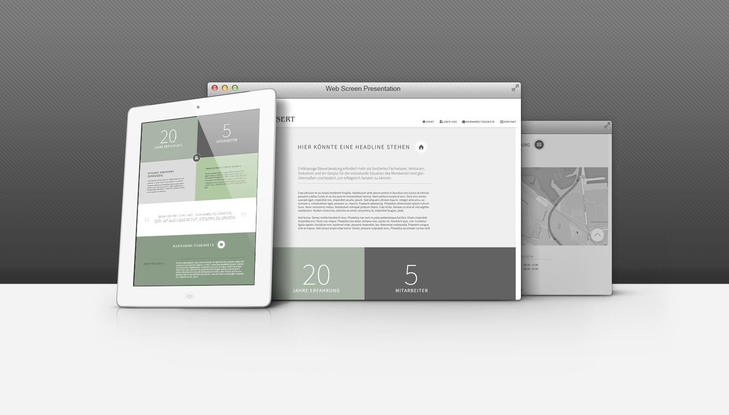
October 2014In 2014, the previous visual identity of the Klassert accountancy firm lagged significantly behind contemporary standards. Despite being constrained by a fixed budget and time limitations, the mandate was clear: to craft a representation that aligned not only with contemporary visual aesthetics but also encapsulated the firm's core attributes of expertise, integrity, and reliability. In accordance with the Klassert firm's request, the adaptation adhered to the pre-existing color scheme, which was seamlessly integrated.
New look, new concept
Although the previous web presence was not abundant in textual content, the primary focus of the adaptation was to acknowledge this aspect and craft the new presence with simplicity and clarity in mind. Departing from the prior page structure, which segmented the entire content into various subpages, the decision was made to opt for a one-page design – a solution that best accommodated all of the client's requirements.
Given the significance of being a long-standing, traditional family business, this sentiment was artfully conveyed through the incorporation of a four-panel design. Additionally, the content sections were distinctively visually separated from one another. To infuse some dynamism into the concept, a set of visual icons were introduced. The font 'Source Sans Pro' was meticulously chosen, as it possesses the attributes necessary for a typeface to convey solidity, clarity, and seriousness in both readability and appearance.
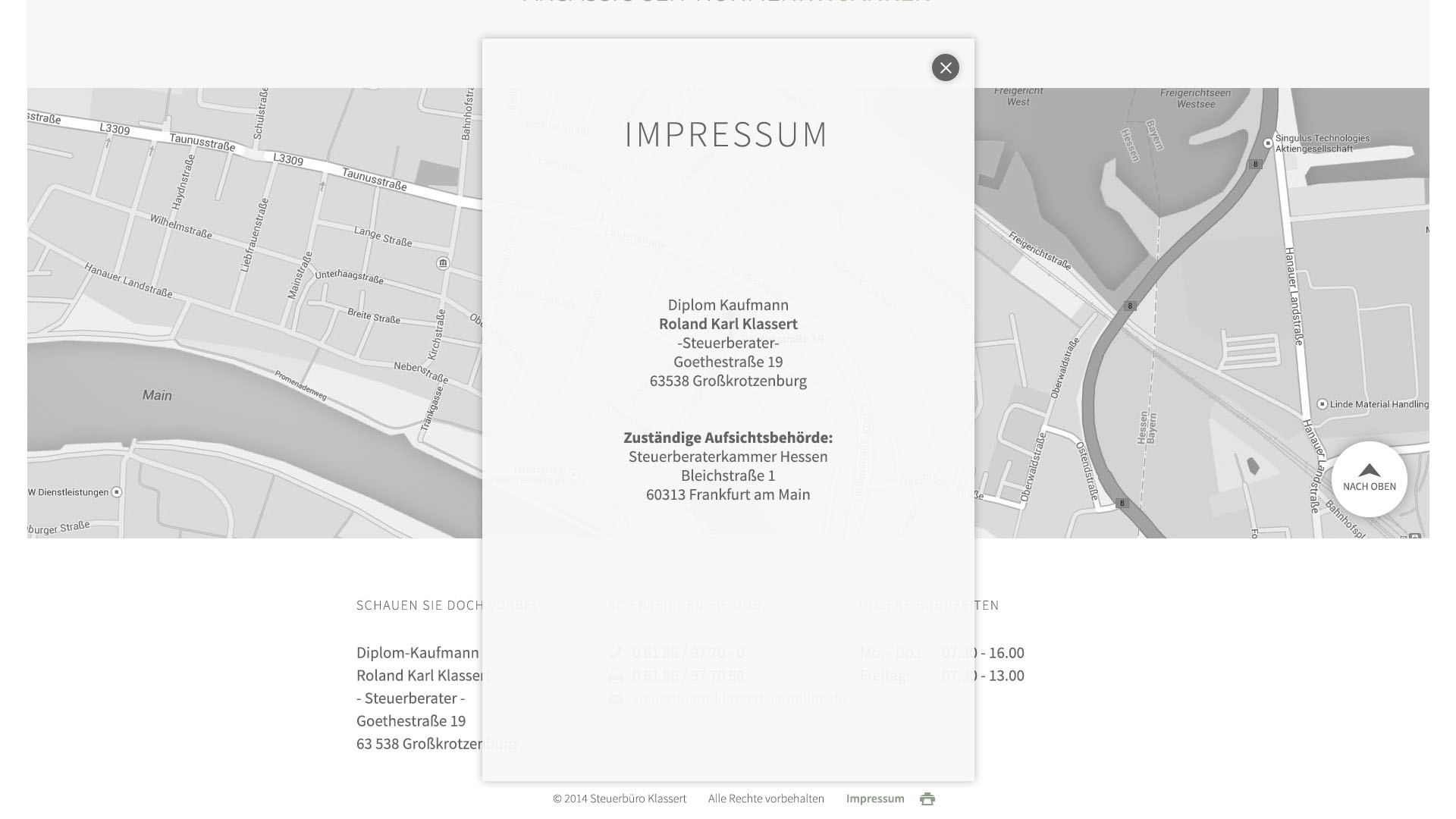
Lastly, it's worth noting that the integrated map was harmoniously adjusted to harmonize with the specific color scheme, rounding out the cohesive visual presentation. The final result can be viewed here.
Project Keyfacts
- fix low budget
- time limited
- adaption of colour scheme
- reflection of values