Category: personal
B.A. Thesis - The Old Shepherd
July 2014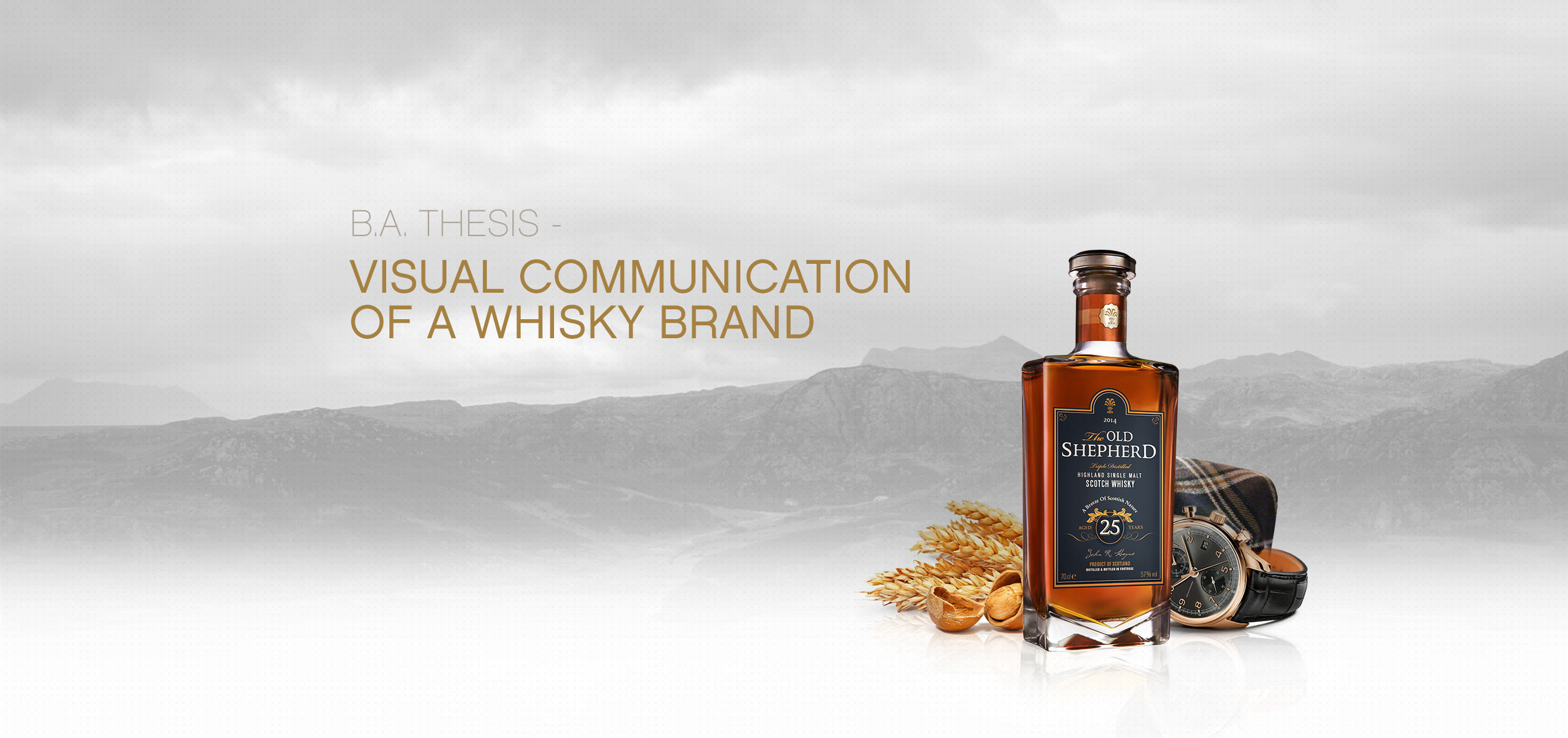
Ivor Brown, a British journalist, once encapsulated the essence of Scotch with his words: "Scotch keeps a secret, the magic fascination of its home country." The debate over whether the audacious Scotchmen or the jovial Irishmen deserve the credit as the true pioneers of this centuries-old distillate persists. However, what remains undeniable is the fact that the character of this product can be as diverse, varied, and invigorating as the very nature that provides its elemental components.
Through the ages, whisky has solidified its place as a foundational element within the spectrum of spirits, catering to a wide array of tastes and sensibilities. Even now, a rich tapestry of distilleries, products, and enthusiasts populate the landscape. Nonetheless, like all commodities, whisky necessitates the same vital marketing strategies to secure its competitive standing within the spirited market.
The presented subject of the Bachelor's thesis delves into the creative developmental process, outlining three distinct concepts for positioning a fictional product. This undertaking involves a thorough exploration of a marketing strategy, alongside the skillful crafting of a bottle label and a multimedia presentation in the form of a visualized product page. Culminating in a comprehensive 125-page book, this journey captures not only the entire process but also the multifaceted ideas that contributed to its formation.
For those who wish to delve further into the documentation, the accompanying PDF can be accessed at the bottom of the page.
Concept One - A Natural Symbiosis

Concept Two - An Outstanding Experience
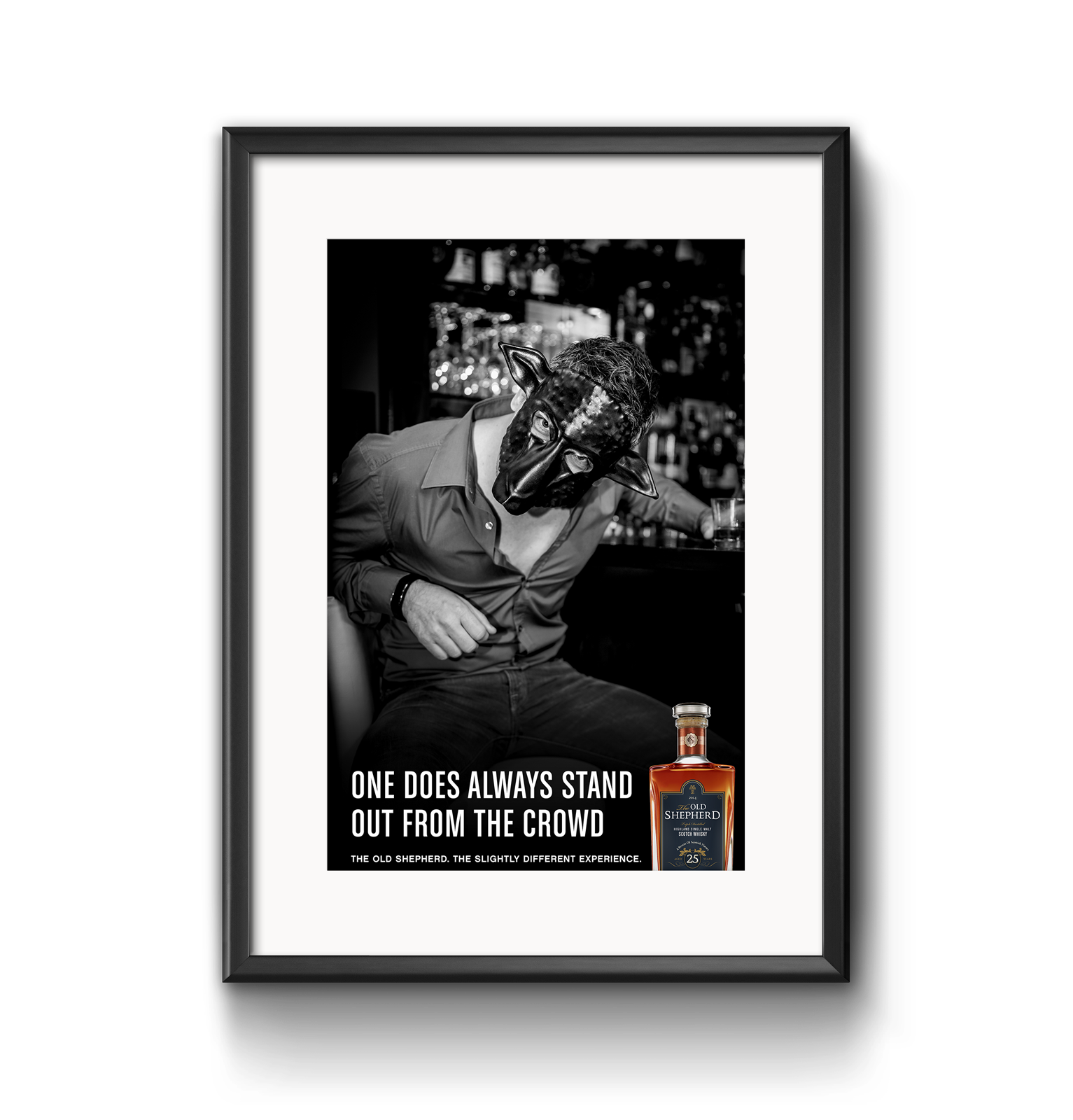

Concept Three - Scottish Humorous


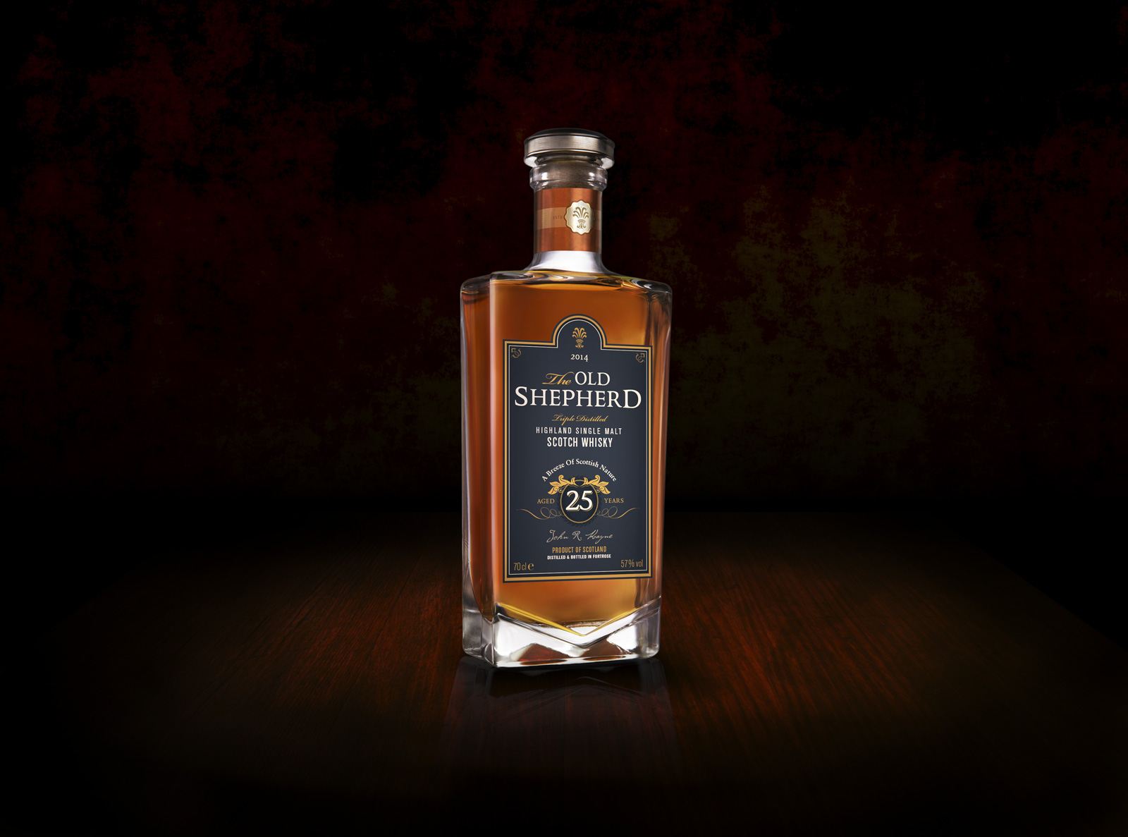
Artful design - The Label
One of the most influential factors contributing to the recognition of a whisky brand, aside from its name, is the logo and especially the bottle label. The selection of colors was a deliberate decision, aiming to establish a symbiosis between the rugged, profound character of the Scottish landscape and the bronzed essence of the grain distillate. A few carefully placed ornaments serve to underscore the origin and value of the product.
In terms of typographical content, a crucial emphasis was placed on achieving harmony and aesthetic coherence among individual elements. Fonts were chosen according to the specifications outlined in the development of the fictional corporate identity guidelines. This meticulous selection aimed to cultivate a consistent visual presentation across the bottle label, marketing concept, product page design, and documentation, all of which can be explored in further detail within the documentation itself.

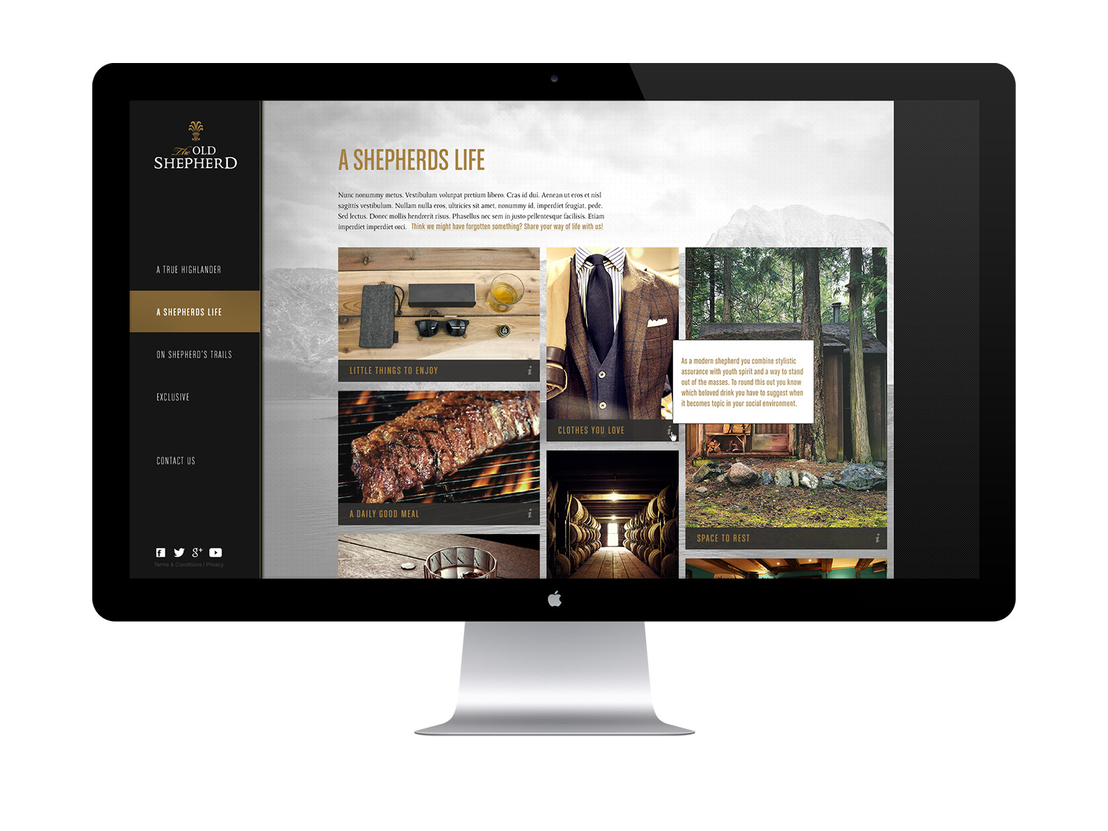
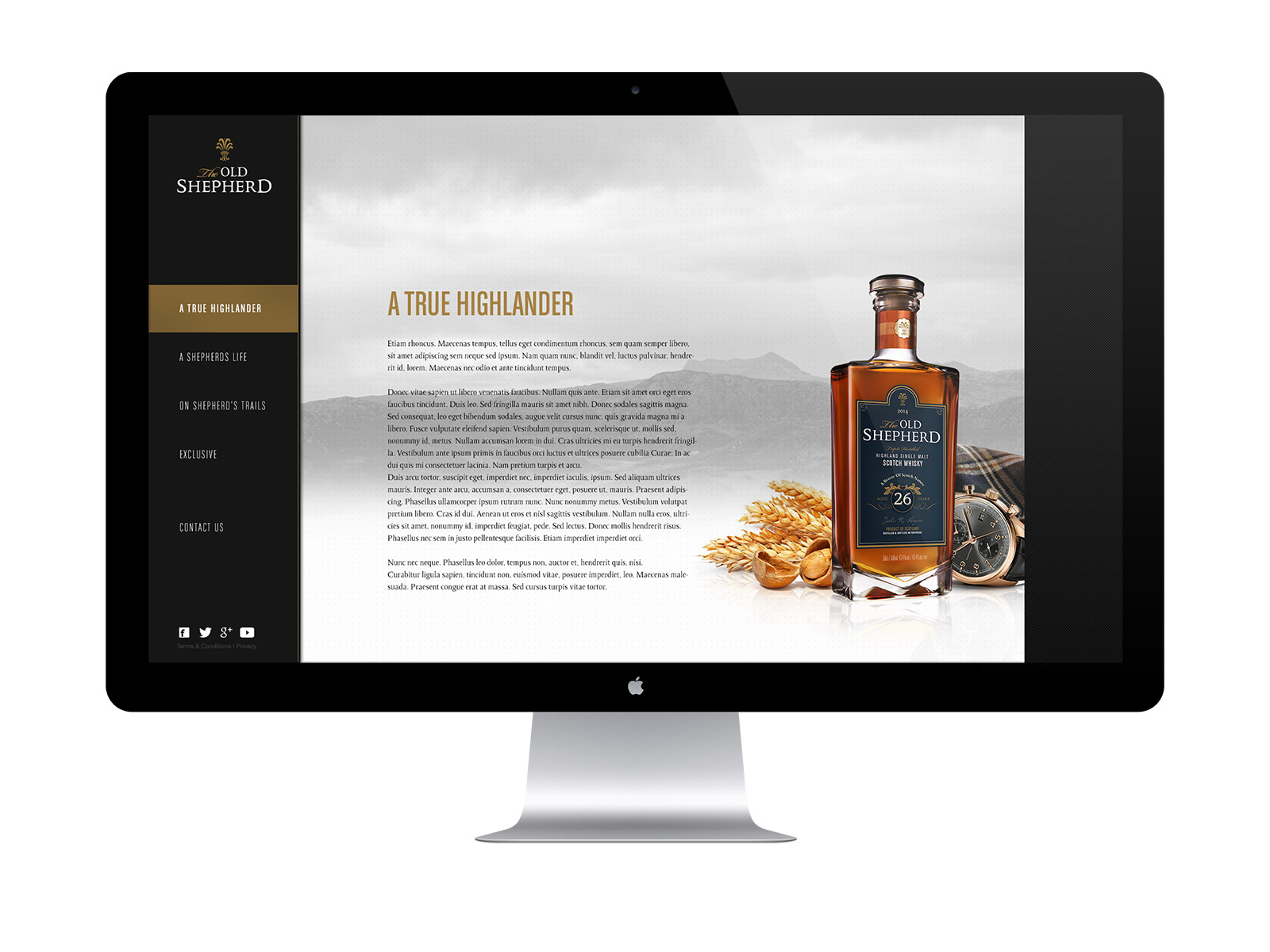
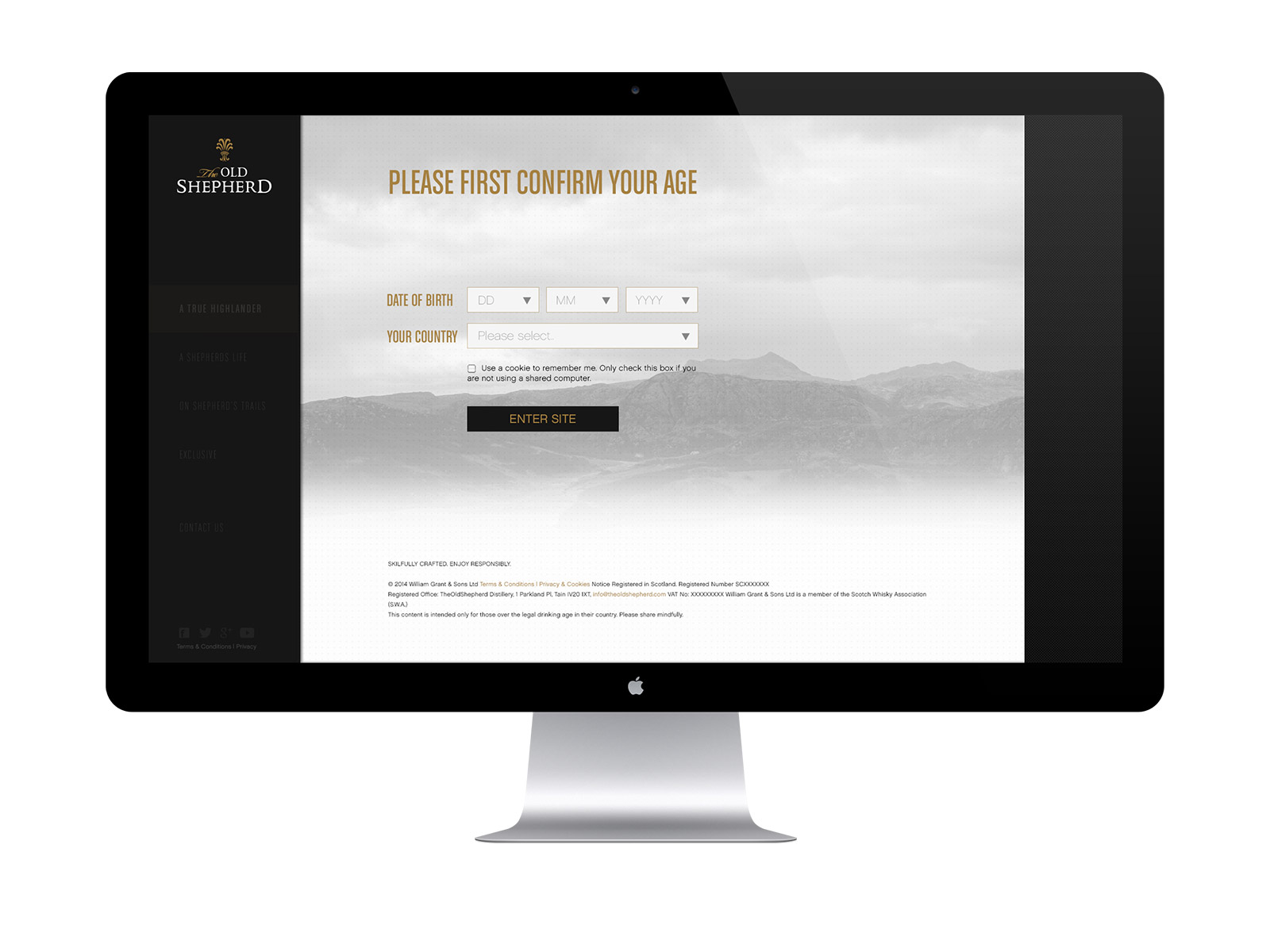
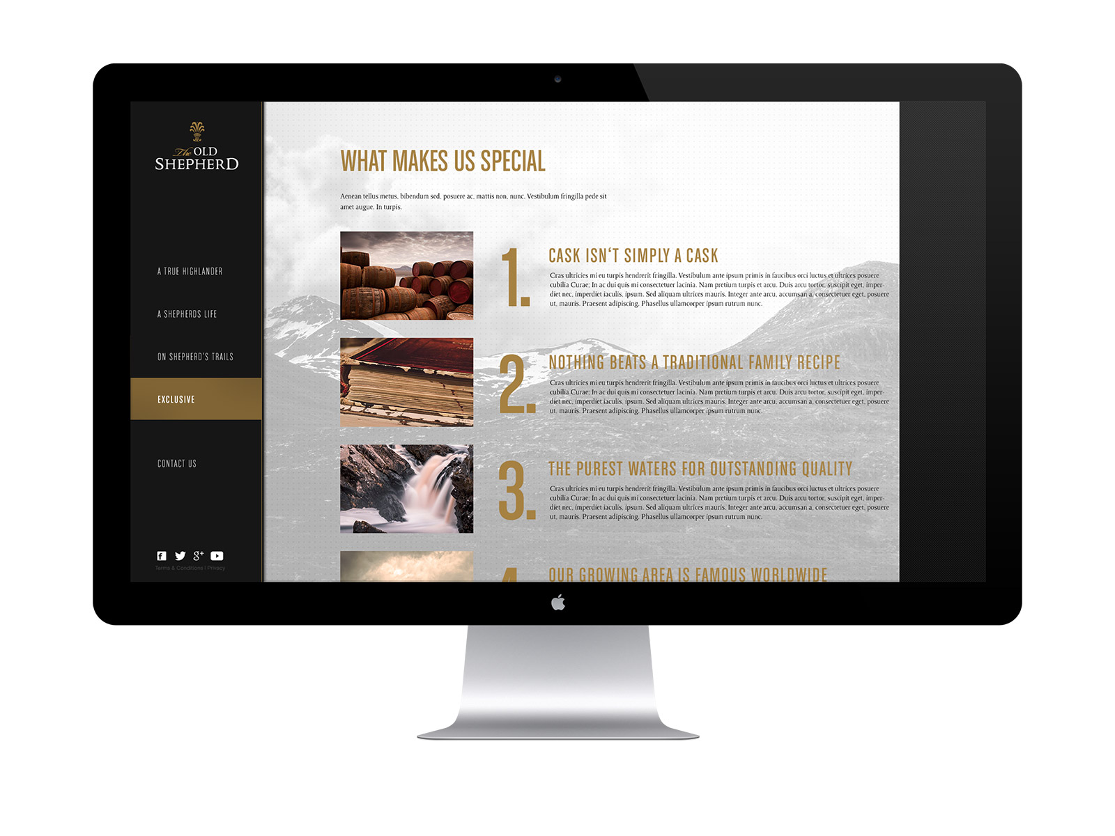
Product Page Conception
In the present day, creating a standalone website dedicated to a single product manufactured by a company is a well-established practice. This approach offers the advantage of presenting the product with distinct positioning on the internet, enabling the dissemination of comprehensive information about the item. Additionally, this approach facilitates a targeted focus within the realm of merchandising.
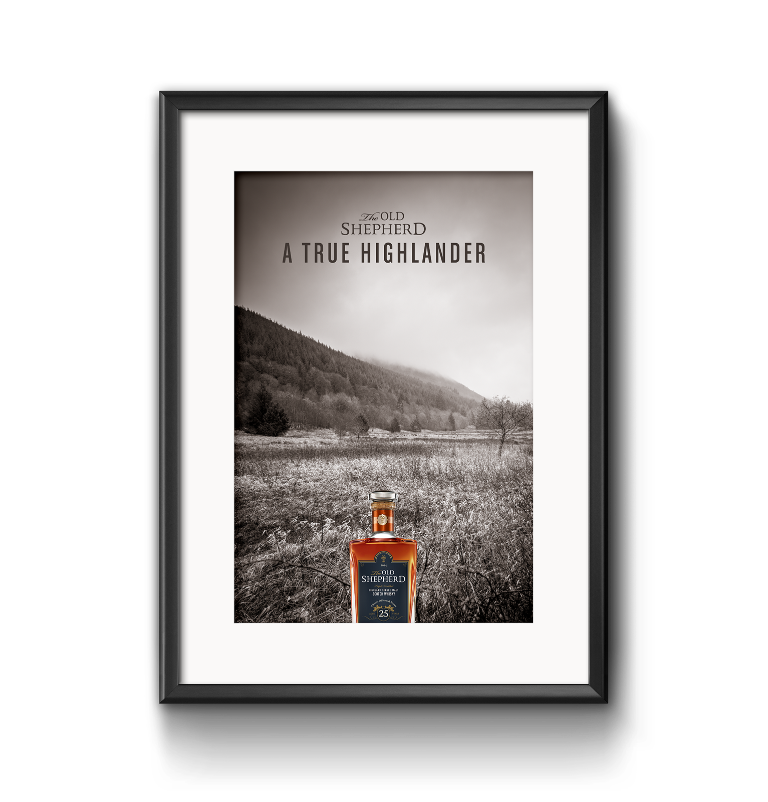
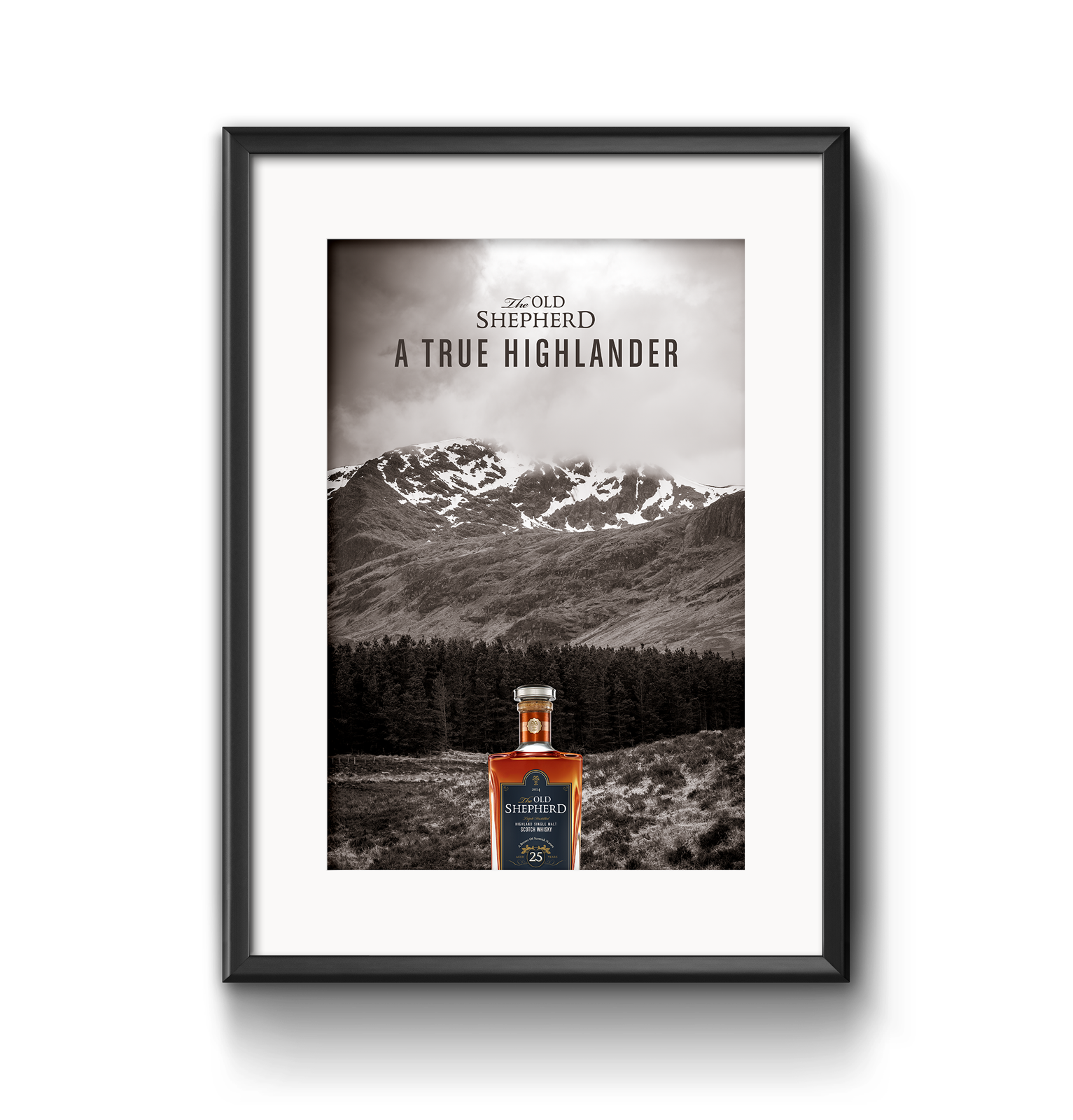
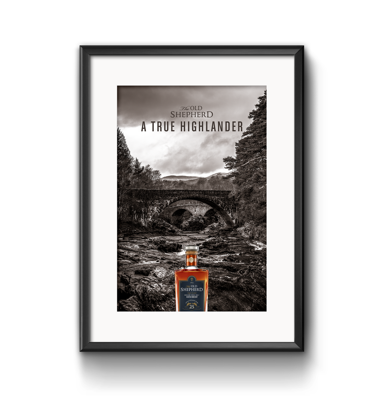
This is the underlying purpose of the designed product page – to place a deliberate emphasis on the product's inherent values and intricate details, encompassing its history, origin, ingredients, and more. Given that Whisky isn't universally appealing and often occupies a higher price bracket, a 25-year-old whisky can be perceived as a personalized lifestyle item. 'The Old Shepherd' stands as an exclusive and luxurious product, warranting a fitting promotional strategy. Allow the following images to serve as a source of inspiration.
Project Keyfacts
- 12 day trip with over 2k pictures taken
- labour of love
- beautiful & detailed documentation book
- view doc. here